
Why Red Light Is Suddenly Everywhere
As a red light wellness specialist, I spend much of my time in clients’ homes, helping them turn plain corners into restorative, energizing spaces. Over the last few years, one change has been impossible to ignore: designers are no longer hiding red light. They are celebrating it.
From TikTok’s “unexpected red theory” to moody red lamp shades and color‑tunable LED strips, red light has moved from niche accent to a central design conversation. Designers are pairing what we know from color and lighting psychology with the growing interest in at‑home wellness habits, using red not just as a color, but as a tool to shape how a room feels and functions.
The trend is not only aesthetic. Research on color and light shows that red is uniquely powerful. It captures attention, affects arousal, and changes the way we perceive space. Designers are leaning on that evidence to integrate red light more intentionally, especially in living rooms, dining spaces, home offices, and wellness corners.
In this article, I will walk you through what the science actually says, how designers are applying it, and how you can bring red light into your home in ways that support both design and well‑being without turning your space into a nightclub or a clinic.
What “Red Light” Means In Home Design
When clients tell me they want to “add red light” at home, they are usually talking about three different things without realizing it. It helps to separate them, because the design and wellness implications differ.
Type of red in the home |
What it usually looks like |
How designers use it now |
Red surfaces and objects |
Red sofas, rugs, artwork, doors, tableware |
To set mood, signal energy, or create a visual focal point in a neutral room |
Red ambient lighting |
Red‑tinted bulbs, LED strips, red lamp shades, colored pendants |
To shift the overall atmosphere in a space toward warmth, drama, or intimacy |
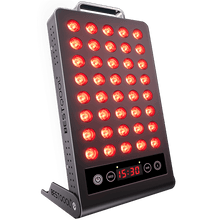
Panels, bars, or small fixtures that emit red light in a focused beam |
To support specific routines, such as evening wind‑down, creative focus, or home workouts, while increasingly being integrated into the design language of the room |
Most of the scientific research in your notes deals with color experience and colored lighting rather than clinical “red light therapy” protocols. That is important. Designers are not prescribing medical treatments. They are drawing on evidence about how red light and color influence mood, arousal, and perception, then building that into aesthetically pleasing spaces and wellness‑supportive routines at home.
The Psychology And Science Behind Red Light
Red As A High‑Energy, Attention‑Grabbing Color
Across multiple color‑psychology sources, red consistently appears as one of the most stimulating hues. Articles on interior and environmental psychology describe red as linked with energy, excitement, passion, love, danger, and urgency. It can raise heart rate and adrenaline and is best used thoughtfully rather than everywhere, especially in smaller rooms.
Hospitality and restaurant design research echoes this. Warm colors such as red, orange, and yellow are considered appetite stimulants and social activators. Red in particular is associated with ripe foods and higher energy, and can encourage faster ordering and stronger engagement with the dining experience. That is one reason fast‑casual brands often weave red accents into their interiors.
There is also evolutionary context. Red stands out sharply against natural greens, which may have helped our primate ancestors identify ripe fruits and young leaves. Modern studies find that red is especially good at capturing and holding attention in emotional situations. It is used in stop signs, warning lights, and phrases such as “red flag” for a reason.
In competitive contexts, red carries a dominance signal. Analyses of the 2004 Olympic Games, where athletes were randomly assigned red or blue uniforms in some sports, showed that contestants wearing red were more likely to win in many rounds. Later work suggests this effect may partly reflect referee bias, with referees perceiving red‑clad competitors as more dominant. Either way, red consistently communicates power and intensity.
Designers know this, even when they do not quote the studies directly. When they introduce a red pendant, side chair, or lamp shade, they are inserting a potent attention anchor.
Red Light, Mood, And Arousal
The notes you shared include several strands of evidence about how colored light influences mood and physiology. Put together, they paint red light as neither purely calming nor purely agitating, but context‑dependent.
Studies summarized in design and lighting articles show that saturated colors, including red, can trigger a physiological “arousal” response: changes in blood pressure, breathing, skin conductance, and reaction speed. Red is often described in participants’ language as stimulating, exciting, or warm.
At the same time, a lighting brief notes that red light may sometimes feel calming because the human visual system is less sensitive to longer‑wavelength red than to shorter‑wavelength blue. Under dim red, the world can feel quieter and less visually busy, which some people experience as soothing.
Other sources highlight potential cautions. Experiments using virtual reality to make a subject’s arm appear as if bathed in red light found that the pain threshold dropped under red compared with other colors. This suggests that heavy, immersive red lighting may heighten pain sensitivity in some contexts.
Commercial lighting summaries targeting office design add another layer. They report that red‑rich light can reduce glare, interact differently with receptors in the eye, and may help maintain melatonin rhythms compared with bright blue‑heavy light at night. They also associate red lighting with deeper focus and reduced stress when used appropriately, though these claims are still emerging and not heavily quantified.
For at‑home design, the practical takeaway is nuance. Red light can energize, draw focus, and add emotional intensity. In low doses, it may feel cozy or intimate. In large doses or at high brightness, it can be overstimulating or even uncomfortable. Designers working with wellness‑oriented clients are trying to stay on the supportive side of that line.
Colored Lighting And How We Perceive Space
Red light does more than change how we feel; it changes how we see a room.
An experimental study with almost one hundred young adults compared how the same interior was experienced under white, green, and red lighting. Participants rated the space on pleasantness, arousal, aesthetics, usefulness, comfort, spaciousness, color quality, and lighting quality.
The results are important for design:
Under white light, the room felt more useful, spacious, clear, and luminous.
Green light performed almost as well as white on usefulness and spaciousness, and was rated equally comfortable.
Red and green lighting together were seen as more aesthetic than plain white lighting.
Pleasantness did not differ significantly between white, green, and red, and there were no meaningful differences between men and women.
What designers are taking from this kind of work is that colored light can boost perceived beauty and atmosphere without necessarily making a room feel less pleasant, but strong color alone is not ideal for tasks that require clarity or a sense of openness. That is why you see so many layered lighting schemes: white or soft neutral light for the base, with red accents adding character and drama.
More recent psychological models, discussed in work published in Frontiers in Psychology, argue that colored lighting shapes mood and the way we interpret what we see, especially in display or gallery‑like spaces. Designers of home wellness corners borrow these ideas when they build “mini environments” with carefully tuned light, artwork, and objects that invite a particular state of mind.
The “Unexpected Red” Effect In Real Homes
On social platforms, the “unexpected red theory” has helped push red back into mainstream design conversations. The idea, coined by a designer on TikTok and explored by writers on color and joy, is simple: put a small, intentional red object into a room where red seemingly does not belong, and the room suddenly looks more cohesive and alive.
This is not solely about trend. Color research helps explain why it works. After years of minimalist, gray‑beige interiors, many rooms lack strong color contrast. A saturated red object jolts our attention system, breaking monotony and introducing what researchers call a “surprise aesthetic,” which can boost experienced joy.
Red also has complementary relationships with many other colors. Design experts point out that traces of red appear in numerous hues, so a red accent often harmonizes more easily than people expect. The combination of surprise and underlying harmony makes a little red go a long way.
From a wellness perspective, that matters. Homes that feel visually flat can sap energy and creativity. A cross‑cultural study of office spaces found that people working in more colorful environments felt more alert, confident, and friendly than those in dull, colorless settings. Thoughtful pops of red are one way designers are bringing that insight into homes without overwhelming sensitive nervous systems.
Why Designers Are Leaning Into Red For At‑Home Wellness
From Greige Minimalism To Color‑Positive Calm
For years, many clients were told that the path to a “calm” home meant white walls, gray sofas, and barely‑there color. What we have learned from both research and lived experience is that emotional well‑being is more nuanced.
Color psychology sources describe how balanced palettes perform better than extremes. Red, bright yellow, and heavy black can be overwhelming when overused, but a mix of warm and cool colors, plus neutrals, tends to feel engaging without exhausting. Green and blue are repeatedly associated with calm and balance, while small doses of red can add vitality, warmth, and a sense of life.
Designers have been returning to this balanced approach. Instead of hiding red entirely, they use it to keep serene spaces from sliding into emotional flatness. A muted blue bedroom might gain a single red lamp shade. A pale kitchen might gain red cookware or a red‑tinted backsplash. The result can feel more human and lived‑in while still gentle.
Aligning Light With Daily Rhythms
The research you shared also underscores how crucial light is for sleep, mood, and daily rhythms. Natural daylight exposure in offices is linked with better sleep quality, more physical activity, and higher productivity. Too much harsh artificial light at night, especially white and some amber light, can disrupt sleep physiology in animal studies, raising concerns about similar impacts in humans.
Traditional clinical light therapy for seasonal affective disorder uses bright white or sometimes blue‑leaning light in the morning to support mood. Reviews in mood‑disorder journals point out that the evidence is mixed and still evolving, but the basic principle is clear: light is not neutral. It interacts with our biology.
This is where designers and wellness practitioners have started to consider red and amber‑rich lighting. Because red light interacts differently with receptors in the eye and may have less impact on melatonin than bright blue‑white light, some office‑lighting specialists suggest using red‑enhanced light later in the day for alertness with less disruption to sleep. Articles on psychological lighting also describe amber and warm reds as more circadian‑friendly than intense cool white at night.
At home, that translates into strategies like bright, neutral light for daytime workspaces and kitchens; softer, warm light toward the evening; and, in some cases, short periods of red‑rich light before bed to maintain visibility without flooding the brain with a “daylight” signal. Because human research is still developing, I encourage clients to treat these choices as supportive habits rather than therapies and to pay close attention to how their own body responds.
Red Light As A Focal Point For Daily Rituals
In my own practice, one of the most meaningful shifts has been the way people frame their red light use as ritual rather than gadget. Designers play a big role in that.
Instead of leaving a red‑emitting device standing alone in a corner, we build it into a small, intentional zone. A red panel might be centered on a textured wall, with a comfortable chair, a plant, and a shelf of favorite books nearby. We might pair it with tunable overhead lighting that fades from neutral to warm as the day ends.
Because research shows that colored lighting can change both mood and the perceived “interestingness” of what we see, these zones become small immersive experiences. A client may stretch, journal, or meditate there for a few minutes each evening. The red light is part of the atmosphere, not the entire story.
Practical Ways Designers Are Integrating Red Light At Home
Living Rooms: Subtle Glow Instead Of Overload
In living rooms, the trend is away from harsh red washes and toward subtle, layered glow.
Designers often start with a comfortable base of white or warm‑white lighting that supports everyday activities. Then they introduce red through targeted elements. A red lamp shade can cast a warm, romantic light in one corner while looking like an ordinary, elegant object during the day. A strip of LED lighting behind a bookshelf or piece of art can be tuned to a soft red for movie nights and lowered to barely above a glow, preserving intimacy without making the entire room feel like a bar.
Decor choices reinforce these effects. Articles from decor experts show how a single red sofa, rug, or side chair can become a vibrant focal point, especially against white, gray, or natural‑wood backdrops. Designers sometimes coordinate the upholstery color with the hue of red light used in the space so that, when the lights dim, the room does not feel fragmented.
For clients who own more technical red‑emitting devices, we look for ways to visually integrate them. Mounting a panel within a simple wood frame, aligning it with existing artwork, or recessing it into a built‑in unit can make it feel like part of the design rather than an afterthought.
Bedrooms: Balancing Romance, Calm, And Sleep
Color psychology sources describe red as intense and stimulating, suitable for social areas but potentially too arousing for sleep if used heavily. At the same time, lighting guidance notes that warm, low‑Kelvin light, including red and amber, tends to support relaxation better than bright, cool light at night.
Designers reconcile these truths by focusing on dose and placement. In bedrooms, red usually appears as a soft accent rather than a main wall color. Deep red lamp shades on small bedside lamps, used at low brightness, can create a cocooned, romantic atmosphere. Soft reds like blush or muted terracotta can appear in textiles, while the overall light remains warm‑white and adjustable.
Because some experiments suggest immersive red light can lower pain thresholds, and because bright light in general can affect sleep, I encourage clients to schedule any intense red‑light use earlier in the evening rather than immediately before trying to fall asleep. Dimmer, indirect red or amber light can then take over as a night‑time backdrop, providing enough visibility for winding down without mimicking daylight.
Kitchens And Dining Rooms: Appetite And Social Energy
Research on restaurant interiors shows that warm hues, especially red and yellow, can stimulate appetite and encourage social interaction. Red is linked with energy and even with making foods appear more appealing or sweet. That is why you see it so frequently in branding and decor for dining spaces.
Home designers borrow these insights in measured ways. In a dining room, a rich red wall or set of red dining chairs can feel luxurious and intimate, especially with white or wood furniture and warm, dimmable lighting. In a kitchen, red may appear in the backsplash, on cabinet fronts, or in smaller appliances and cookware. Articles on home decor suggest pairing strong red elements with neutral countertops and stainless steel to keep the overall space feeling clean and bright.
Red lighting adds another layer. A soft red or amber pendant over the table can deepen the sense of warmth at dinner while the rest of the room stays lit in neutral tones for practical tasks. Because studies of colored lighting indicate that red and green light can boost perceived aesthetics without reducing pleasantness, these touches often make everyday meals feel more special with little downside, as long as task areas remain properly illuminated.
Home Gyms And Wellness Rooms: Focused Intensity
Home exercise spaces are natural homes for red. Color‑psychology write‑ups describe red and orange as energizing and movement‑oriented, suitable for workout rooms. Lighting guidance for gyms and clubs also notes that blue and red lights are often used to enhance stimulation and intensity.
In a wellness or gym room, designers may combine neutral overhead lighting for safety with colored accents that can be turned on during specific routines. A red‑tinted LED strip along the baseboards or a red backlight behind a mirror can create a sense of drive and focus for short high‑intensity sessions.
When clients are interested in using red‑emitting devices during stretching or post‑workout cool‑downs, we emphasize contrast. A small area with red light and darker surroundings can feel like a finite “pod” for effort or recovery. Outside that zone, softer white or green‑leaning light keeps the space from becoming visually exhausting. Experimental work on colored lighting and impressions supports this idea of tuning different zones to different emotional tones.
Home Offices: Targeted Red For Motivation, Not Overstimulation
Workplace lighting summaries highlight red office light as a potential tool for enhancing efficiency, noting that red wavelengths can reduce eye strain in some conditions and may minimally disrupt melatonin late in the day compared with bright blue‑white light. Psychological descriptions of red also associate it with action, ambition, and determination.
At the same time, other lighting guides caution that red LED light can heighten emotionality and even impulsiveness if overused. Blue and green light often better support sustained cognitive performance and relaxation.
In home offices, designers therefore use red sparingly, usually as a motivational cue rather than a constant bath. A red desk lamp with adjustable color, a small red accent wall behind the monitor, or a red art piece in the periphery of vision can introduce that sense of drive. Primary task lighting typically stays neutral or slightly cool to support focus.
Clients who work late sometimes choose to shift their light toward warmer tones in the last hour or two of work, occasionally experimenting with red‑rich settings to reduce glare. Because there is no one‑size‑fits‑all answer yet, I advise people to monitor their own concentration, mood, and sleep when making these changes, and to make adjustments in conversation with their health professional if they have existing sleep or mood conditions.

Pros And Cons Of Designing With Red Light
The rise of red light in home design is exciting, but like any powerful tool, it has trade‑offs. Designers who specialize in wellness‑oriented spaces weigh these deliberately.
Aspect |
Potential benefits of red light in design |
Potential downsides or cautions |
Mood and energy |
Can boost energy, excitement, and social engagement; small doses can make rooms feel joyful, warm, and alive |
In large doses or at high brightness, can feel agitating, stressful, or overwhelming, especially for sensitive individuals |
Aesthetics |
Enhances visual interest and perceived aesthetics compared with plain white light; supports “unexpected red” focal points that make rooms memorable |
Too much red can visually dominate, make rooms feel smaller, or clash with existing palettes if not harmonized |
Perception and function |
Helps create intimate, dramatic zones within otherwise functional spaces; can reduce glare in some office setups |
Pure red lighting alone can reduce perceived clarity, usefulness, and spaciousness compared with white or green lighting; not ideal as the only light for tasks |
Social and emotional signaling |
Conveys warmth, passion, hospitality, and confidence in living and dining areas |
Also carries associations with danger, anger, or urgency; may not be appropriate for all users or all rooms, such as healthcare settings |
Daily rhythms |
Warm and red‑leaning light seems less likely than bright cool white to disrupt evening wind‑down; may support later‑day comfort without simulating midday sun |
Evidence on long‑term circadian effects in homes is still limited; relying on red light as a “sleep fix” without broader lifestyle changes is not supported by current research |
In my experience, these tables translate into a simple principle. Red light belongs in a layered, flexible system, not as a single dominant note. When you can raise, lower, and shift your lighting and when red sits alongside calmer colors and plenty of natural light, it tends to work beautifully.

Choosing Red Light Products With Both Design And Wellness In Mind
When clients ask where to start, I suggest thinking less about gadgets and more about habits. Then we choose red‑friendly products that support those habits while looking at home in the space.
Begin with your daily rhythm. Notice where you need energy, where you need calm, and where you routinely feel flat or uninspired. Research on colored lighting and mood suggests that bright, neutral or slightly cool light during daytime supports alertness and clarity, while warm and green‑leaning tones support relaxation and comfort. Red can then be layered in for particular moments: a burst of focus in the home office, a cozy dinner, a brief evening ritual.
For fixtures and bulbs, LED technology makes it easier than ever. Lighting guides describe how modern LEDs can span warm to cool color temperatures and even shift among red, green, and blue to create countless hues. Choosing dimmable, color‑tunable lamps or strips lets you experiment gently. You might find that a deep amber feels better than a pure red in your bedroom, or that a soft crimson backlight in your living room is just enough to change the mood.
Consider integration. Articles from design firms emphasize that lighting should work hand‑in‑hand with color on walls, textures, and materials. A red lamp shade looks different on a matte plaster wall than against glossy tile. Velvet red shades create a different softness than silk. Testing colors at different times of day and under different light settings can prevent expensive surprises and ensure that your red elements remain enjoyable in real life, not just in photos.
If you use targeted red‑light devices, design around them rather than fighting them. Placing them where you naturally pause each day, giving them a visual “home” with art or shelving, and making sure there is adequate white or neutral light available nearby will make it easier to maintain routines and avoid eye strain.
Most importantly, stay curious about your own responses. Studies offer useful averages, but individuals vary. Some people find red energizing; others experience it as cozy; a few find it agitating. Because the research on long‑term health effects of colored home lighting is still emerging, it is wise to treat red light as a supportive environmental choice rather than a standalone therapy and to consult a healthcare professional before using any light practice in place of medical care.
Frequently Asked Questions
Is red light calming or stimulating?
Both effects are possible, depending on context, brightness, and personal sensitivity. Color‑psychology research consistently describes red as stimulating, attention‑grabbing, and associated with higher arousal, which can mean faster heart rate and stronger emotional responses. At the same time, lighting articles note that red light can feel calming at low levels because our eyes are less sensitive to long‑wavelength red, reducing visual input compared with bright blue‑white light.
In practice, designers use low, indirect red or red‑amber tones when they want warmth and intimacy, for example in a corner lamp, and avoid large areas of bright red in spaces meant for deep relaxation or sleep. If you notice that red light increases your tension or headaches, dial back the brightness or reserve it for shorter, intentional moments rather than leaving it on continuously.
Is it safe to use red light at night?
The notes you provided point out that bright white and amber light at night have disrupted sleep in animal studies, and that red light may interact differently with melatonin systems than blue‑heavy light. Commercial lighting briefs suggest that red‑rich light late in the day might be less disruptive than intense cool white and could reduce glare. However, comprehensive human data on long‑term home use are still limited.
From a wellness perspective, a cautious approach makes sense. Using dim, warm or red‑leaning lights in the evening instead of bright daylight‑mimicking light is generally consistent with circadian‑friendly principles. Avoid staring directly into intense light sources close to bedtime, and if you live with a sleep, eye, or mood condition, discuss any planned change in light exposure with your healthcare provider, especially if you plan to use bright light regularly.
How much red is “too much” in a room?
There is no universal cutoff, but the research and design guidance align on one point: red works best as an accent rather than the only color or light. Color‑psychology sources caution that large areas of strong red can be overwhelming, and lighting studies show that red alone does not support perceived usefulness and spaciousness as well as white or green.
As a practical rule, keep your base palette and lighting functional and comfortable, then layer red into focal points: a lamp shade, a piece of art, a small wall, a tunable strip or pendant. Spend time in the space at different times of day. If you feel on edge, restless, or visually tired, dial down the red or shift part of it toward softer hues like terracotta, golden yellow, or muted plum. Your nervous system will usually tell you when the balance is right.

Closing Thoughts
Used with care, red light can be far more than a trend. It can be a bridge between evidence‑informed design and the everyday rituals that keep you grounded at home. When designers honor both the science and your lived experience, red stops being something to fear and becomes a purposeful tool: a touch of vitality where your life needs it most, wrapped in a home that still feels like yourself.
References
- https://pubmed.ncbi.nlm.nih.gov/25539020/
- https://insightspsychology.org/psychology-of-color-emotional-impact/
- https://dl.acm.org/doi/10.1145/3721238.3730728
- https://www.frontiersin.org/journals/psychology/articles/10.3389/fpsyg.2022.938636/full
- https://www.researchgate.net/publication/270003519_Effects_of_Coloured_Lighting_on_the_Perception_of_Interior_Spaces
- https://www.flexfireleds.com/leds-psychology-light-color?srsltid=AfmBOoorlYztvMdDen7lFV7HKwY_5ODbBRKp6dGrXekqJIEOua2mTpzO
- https://www.marthastewart.com/unexpected-red-theory-8601107
- https://a2zrestaurantconsulting.com/the-impact-of-color-psychology-in-restaurant-interior-design/
- https://aestheticsofjoy.com/the-science-behind-the-unexpected-red-theory/
- https://www.coohom.com/article/how-to-decorate-your-home-in-red-light-center-2019


 Small
Small

 Moderate

 Moderate

 Moderate

 Full
Full

